Client
STA Travel
PRoject
O-Week Tote Bag
______________
STA Travel
PRoject
O-Week Tote Bag
______________
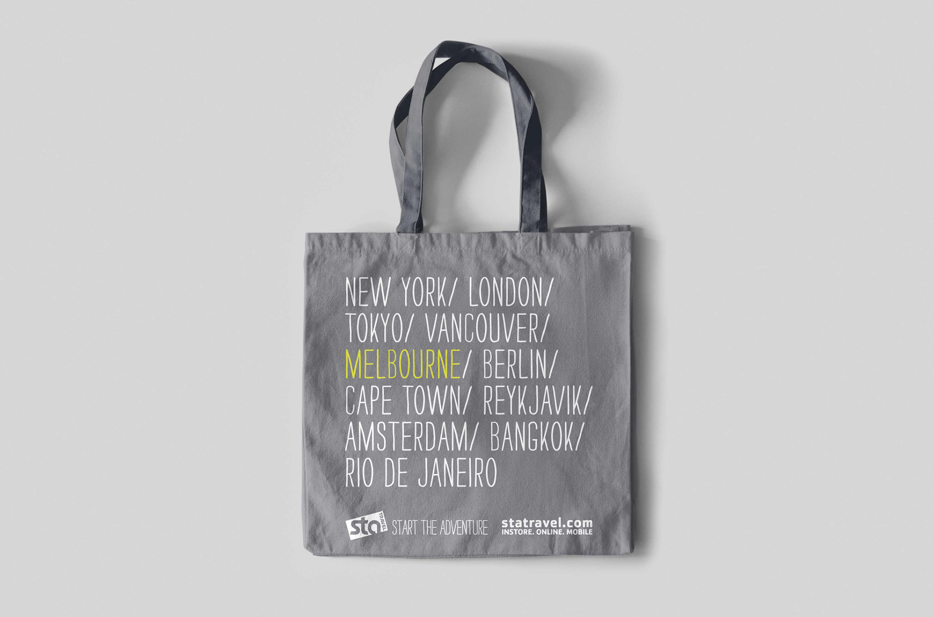
As part of the O-Week activations across universities in Australia, the marketing team asked for a branded tote to give away to new students that would contain promotional material and also grown the email database.
Apart from being practical the tote needed to be a fun accessory people would want to continue to use and in turn promote the brand. For this reason the branding needed to be kept to a minimum so it wouldn’t appear tacky or come across as self promotional and not be used. This was achieved by using the brand logo, tagline and URL, core brand font and colours, and by choosing a fabric colour-way that was gender neutral but also part of the brand colour guidelines.
The cities chosen for the design were places STA Travel were wanting to promote and send drive to as they were considered trending destinations at the time. The choice of cities was also to represent each of the continents STA Travel send passengers to and subtly engage people to consider travelling to these places.
Each state had their own batch of totes created with the capital city of that state being highlighted in the core brand yellow so it felt personalised for that location.